Brand identity that holds up in real interfaces
A brand is not just a logo. The best identity shows up in layout, type, spacing, and tone, and stays consistent as the site grows.
A strong brand identity is not a one time design file. It is the set of decisions that keeps your site consistent when new pages and features are added.
What a usable brand identity includes
- Typography rules
One or two fonts, clear sizes, and predictable heading structure. - Spacing and layout
Consistent gaps, section rhythm, and alignment that feels calm. - Color that supports reading
Accessible contrast and disciplined accent usage. - Components that repeat
Buttons, cards, forms, and navigation that behave the same everywhere. - Voice and tone
Simple language that explains value without exaggeration.
How we make it practical
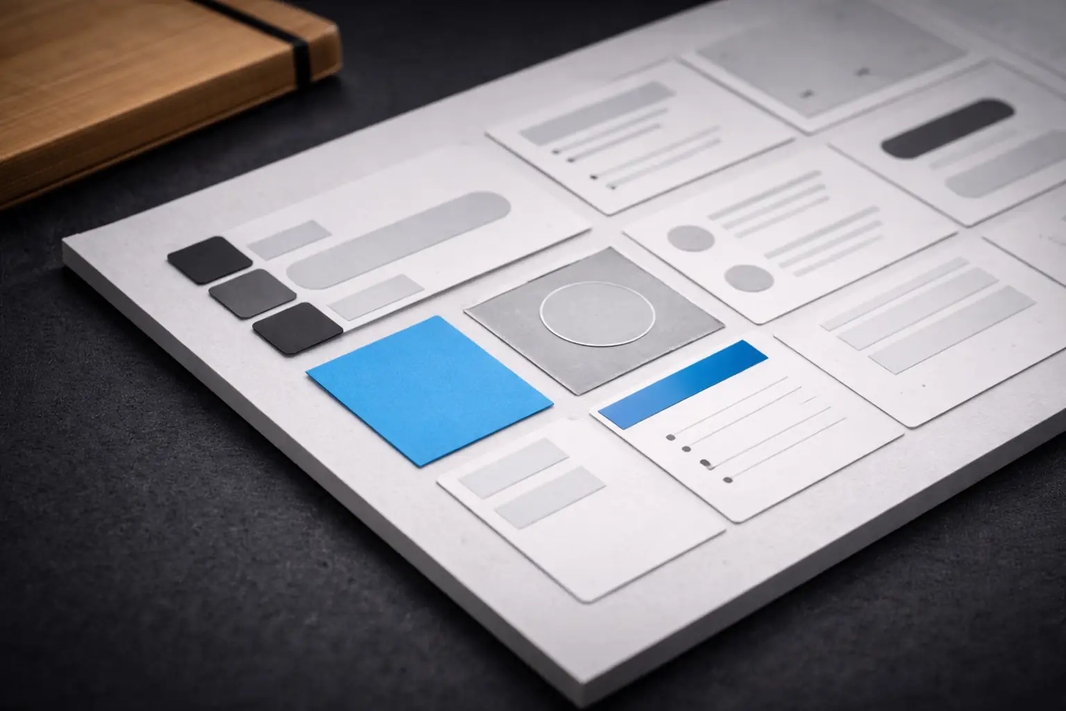
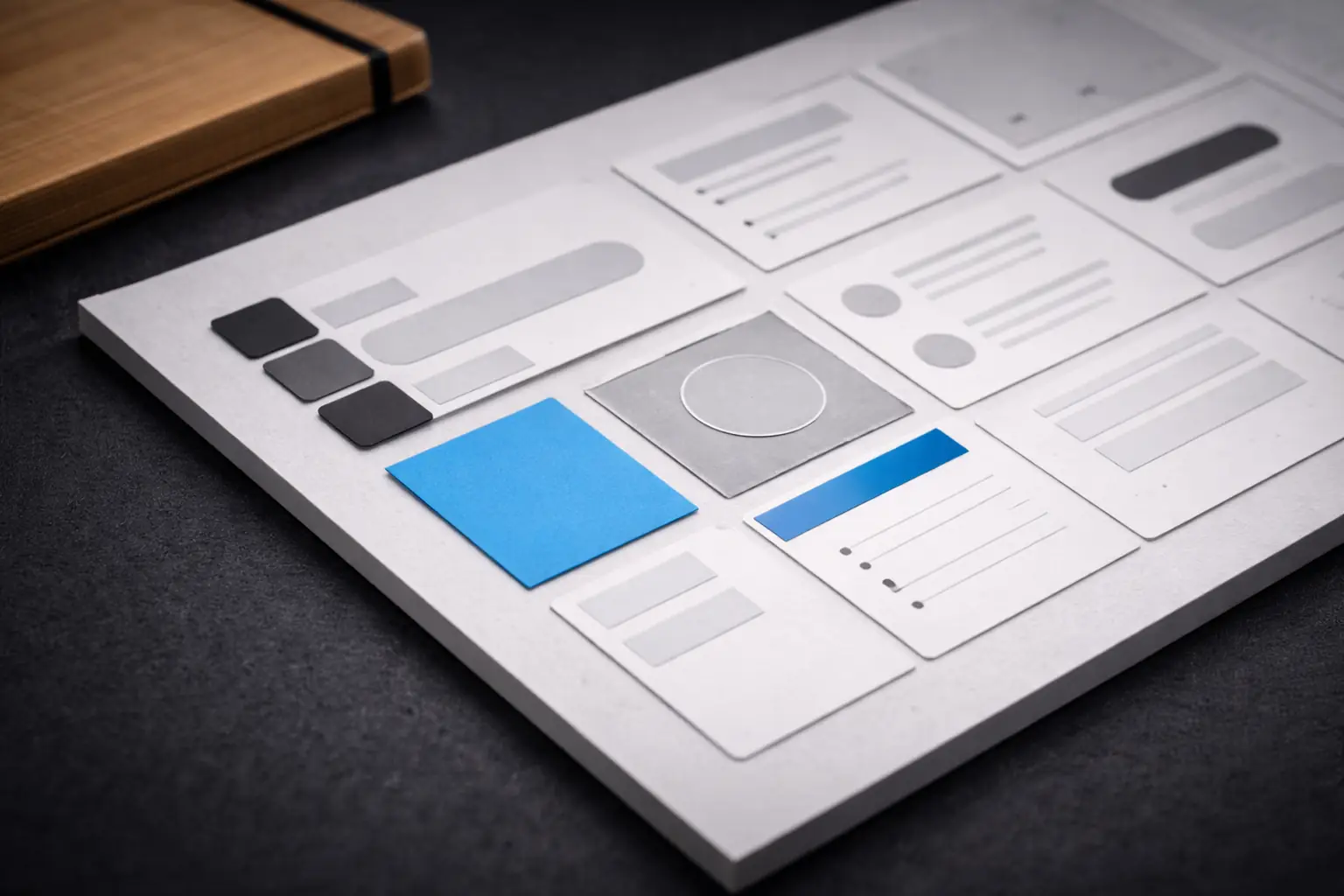
We turn identity into a small system. The system is made of tokens and reusable patterns, so new pages stay consistent without needing a redesign each time.
Good identity reduces future design debt. It makes growth feel intentional.
A quick check
- Do headings look consistent across pages
- Do links and buttons feel like one system
- Do forms look and behave the same everywhere
- Does the site still feel clear on mobile
If any of these feels inconsistent, the fix is usually not a new logo. It is better structure and a tighter system.
Figures